Inheritance diagram for WithNoUIFactories:
 Collaboration diagram for WithNoUIFactories:
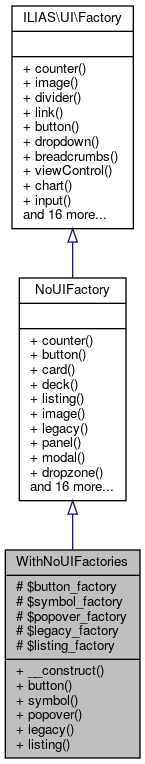
Public Member Functions | |
| __construct ($button_factory, $symbol_factory, $popover_factory, $legacy_factory, $listing_factory) | |
| button () | |
| symbol () | |
| popover () | |
| legacy ($content) | |
| listing () | |
| Public Member Functions inherited from NoUIFactory | |
| counter () | |
| button () | |
| card () | |
| deck (array $cards) | |
| listing () | |
| image () | |
| legacy ($content) | |
| panel () | |
| modal () | |
| dropzone () | |
| popover () | |
| divider () | |
| link () | |
| dropdown () | |
| item () | |
| viewControl () | |
| breadcrumbs (array $crumbs) | |
| chart () | |
| input () | |
| table () | |
| messageBox () | |
| layout () | |
| mainControls () | |
| tree () | |
| menu () | |
| symbol () | |
| counter () | |
| image () | |
| divider () | |
| link () | |
| button () | |
| dropdown () | |
| breadcrumbs (array $crumbs) | |
| viewControl () | |
| chart () | |
| input () | |
| card () | |
| deck (array $cards) | |
| listing () | |
| panel () | |
| item () | |
| modal () | |
| popover () | |
| dropzone () | |
| legacy ($content) | |
| table () | |
| messageBox () | |
| layout () | |
| mainControls () | |
| tree () | |
| menu () | |
| symbol () | |
Protected Attributes | |
| $button_factory | |
| $symbol_factory | |
| $popover_factory | |
| $legacy_factory | |
| $listing_factory | |
Detailed Description
Definition at line 13 of file StandardFilterTest.php.
Constructor & Destructor Documentation
◆ __construct()
| WithNoUIFactories::__construct | ( | $button_factory, | |
| $symbol_factory, | |||
| $popover_factory, | |||
| $legacy_factory, | |||
| $listing_factory | |||
| ) |
Definition at line 22 of file StandardFilterTest.php.
References $button_factory, $legacy_factory, $listing_factory, $popover_factory, and $symbol_factory.
Member Function Documentation
◆ button()
| WithNoUIFactories::button | ( | ) |
description: purpose: > Buttons trigger interactions that change the system’s or view's status. Acceptable changes to the current view are those that do not result in a complete replacement of the overall screen (e.g. modals). composition: > Button is a clickable, graphically obtrusive control element. It can bear text. effect: > On-click, the action indicated by the button is carried out. A stateful button will indicate its state with the engaged state. rivals: glyph: > Glyphs are used if the enclosing Container Collection can not provide enough space for textual information or if such an information would clutter the screen. links: > Links are used to trigger Interactions that do not change the systems status. They are usually contained inside a Navigational Collection. background: > Wording rules have been inspired by the iOS Human Interface Guidelines (UI-Elements->Controls->System Button) Style rules have been inspired from the GNOME Human Interface Guidelines->Buttons. Concerning aria-roles, see: https://developer.mozilla.org/en-US/docs/Web/Accessibility/ARIA/Roles/button_role rules: usage: 1: > Buttons MUST NOT be used inside a Textual Paragraph. interaction: 2: > If an action is temporarily not available, Buttons MUST be disabled by setting as type 'disabled'. 3: > A button MUST NOT be used for navigational purpose. style: 1: > If Text is used inside a Button, the Button MUST be at least six characters wide. 2: > The Button MUST be designed in a way it is perceived as important and active, but not clickable, if the Button is engaged. wording: 1: > The caption of a Button SHOULD contain no more than two words. 2: > The wording of the button SHOULD describe the action the button performs by using a verb or a verb phrase. 3: > Every word except articles, coordinating conjunctions and prepositions of four or fewer letters MUST be capitalized. 4: > For standard events such as saving or canceling the existing standard terms MUST be used if possible: Save, Cancel, Delete, Cut, Copy. 5: > There are cases where a non-standard label such as “Send Mail” for saving and sending the input of a specific form might deviate from the standard. These cases MUST however specifically justified. accessibility: 1: > DOM elements of type "button" MUST be used to properly identify an element as a Button if there is no good reason to do otherwise. 2: > Button DOM elements MUST either be of type "button", of type "a" accompanied with the aria-role “Button” or input along with the type attribute “button” or "submit". 3: > If the Button is carrying the focus (e.g. by tabbing) and is visible it MUST always be visibly marked (e.g. by some sort of highlighting). 4: > All Buttons visible in a view MUST be accessible by keyboard by using the ‘Tab’-Key. 5: > The engaged state MUST be reflected in the "aria-pressed" -, respectively the "aria-checked"-attribute if active.
If the Button is not engaged (which is the default), the aria-attribute can be omitted.
- Returns
- \ILIAS\UI\Component\Button\Factory
Reimplemented from NoUIFactory.
Definition at line 32 of file StandardFilterTest.php.
References $button_factory.
◆ legacy()
| WithNoUIFactories::legacy | ( | $content | ) |
description: purpose: > This component is used to wrap an existing ILIAS UI element into a UI component. This is useful if a container of the UI components needs to contain content that is not yet implement in the centralized UI components. composition: > The legacy component contains html or any other content as string.
rules: usage: 1: > This component MUST only be used to ensure backwards compatibility with existing UI elements in ILIAS,
therefore it SHOULD only contain Elements which cannot be generated using other UI Components from the UI Service.
- Parameters
-
string $content
- Returns
- \ILIAS\UI\Component\Legacy\Legacy
Reimplemented from NoUIFactory.
Definition at line 47 of file StandardFilterTest.php.
◆ listing()
| WithNoUIFactories::listing | ( | ) |
description: purpose: > Listings are used to structure itemised textual information. composition: > Listings may contain ordered, unordered, or labeled items. effect: > Listings hold only textual information. They may contain Links but no Buttons. rules: composition:
1: Listings MUST NOT contain Buttons.
- Returns
- \ILIAS\UI\Component\Listing\Factory
Reimplemented from NoUIFactory.
Definition at line 52 of file StandardFilterTest.php.
References $listing_factory.
◆ popover()
| WithNoUIFactories::popover | ( | ) |
description: purpose: > Popovers can be used when space is scarce i.e. within List GUI items, table cells or menus in the Header section. They offer either secondary information on object like a preview or rating to be displayed or entered. They display information about ongoing processes composition: > Popovers consist of a layer displayed above all other content. The content of the Popover depends on the functionality it performs. A Popover MAY display a title above its content. All Popovers contain a pointer pointing from the Popover to the Triggerer of the Popover. effect: > Popovers are shown by clicking a Triggerer component such as a Button or Glyph. The position of the Popover is calculated automatically be default. However, it is possible to specify if the popover appears horizontal (left, right) or vertical (top, bottom) relative to its Triggerer component. Popovers disappear by clicking anywhere outside the Popover or by pressing the ESC key. rivals: > Modals: > Modals hide all other content while Popovers do not prevent interaction with other parts of the current context. rules: usage: 1: > Popovers MUST NOT contain horizontal scrollbars. 2: > Popovers MAY contain vertical scrollbars. The content component is responsible to define its own height and show vertical scrollbars. 3: > If Popovers are used to present secondary information of an object, they SHOULD display a title representing the object. interaction: 1: > A Popover MUST only be displayed if the Trigger component is clicked. This behaviour is different from Tooltips that appear on hovering. Popovers disappear by clicking anywhere outside the Popover or by pressing the ESC key. style: 1: Popovers MUST always relate to the Trigger component by a little pointer. accessibility: 1: > There MUST be a way to open the Popover by only using the keyboard. 2: > The focus MUST be inside the Popover, once it is open if it contains at least one interactive item. Otherwise the focus MUST remain on the Triggerer component. 3: > The focus MUST NOT leave the Popover for as long as it is open. 4: > There MUST be a way to reach every control in the Popover by only using the keyboard. 5: > The Popover MUST be closable by pressing the ESC key. 6: > Once the Popover is closed, the focus MUST return to the element triggering the opening of the Popover or the element being clicked if the Popover was
closed on click.
- Returns
- \ILIAS\UI\Component\Popover\Factory
Reimplemented from NoUIFactory.
Definition at line 42 of file StandardFilterTest.php.
References $popover_factory.
◆ symbol()
| WithNoUIFactories::symbol | ( | ) |
description: purpose: > Symbols are graphical representations of concepts or contexts quickly comprehensible or generally known to the user.
- Returns
- \ILIAS\UI\Component\Symbol\Factory
Reimplemented from NoUIFactory.
Definition at line 37 of file StandardFilterTest.php.
References $symbol_factory.
Field Documentation
◆ $button_factory
|
protected |
Definition at line 15 of file StandardFilterTest.php.
Referenced by __construct(), and button().
◆ $legacy_factory
|
protected |
Definition at line 18 of file StandardFilterTest.php.
Referenced by __construct().
◆ $listing_factory
|
protected |
Definition at line 19 of file StandardFilterTest.php.
Referenced by __construct(), and listing().
◆ $popover_factory
|
protected |
Definition at line 17 of file StandardFilterTest.php.
Referenced by __construct(), and popover().
◆ $symbol_factory
|
protected |
Definition at line 16 of file StandardFilterTest.php.
Referenced by __construct(), and symbol().
The documentation for this class was generated from the following file:
- tests/UI/Component/Input/Container/Filter/StandardFilterTest.php