Inheritance diagram for ILIAS\UI\Implementation\Factory:
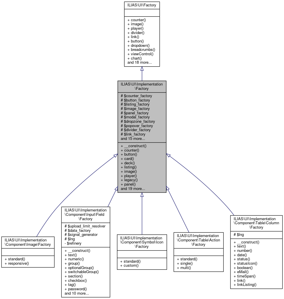 Collaboration diagram for ILIAS\UI\Implementation\Factory:
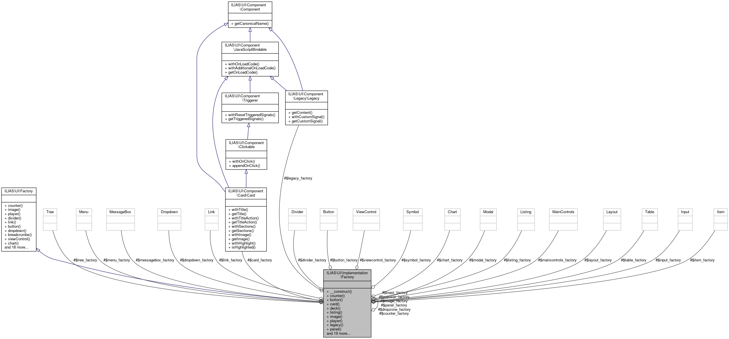
Public Member Functions | ||||
| __construct (C\Counter\Factory $counter_factory, C\Button\Factory $button_factory, C\Listing\Factory $listing_factory, C\Image\Factory $image_factory, C\Panel\Factory $panel_factory, C\Modal\Factory $modal_factory, C\Dropzone\Factory $dropzone_factory, C\Popover\Factory $popover_factory, C\Divider\Factory $divider_factory, C\Link\Factory $link_factory, C\Dropdown\Factory $dropdown_factory, C\Item\Factory $item_factory, C\ViewControl\Factory $viewcontrol_factory, C\Chart\Factory $chart_factory, C\Input\Factory $input_factory, C\Table\Factory $table_factory, C\MessageBox\Factory $messagebox_factory, C\Card\Factory $card_factory, C\Layout\Factory $layout_factory, C\MainControls\Factory $maincontrols_factory, C\Tree\Factory $tree_factory, C\Menu\Factory $menu_factory, C\Symbol\Factory $symbol_factory, C\Toast\Factory $toast_factory, C\Legacy\Factory $legacy_factory) | ||||
| counter () | ||||
description: purpose: > Counter inform users about the quantity of items indicated by a glyph. composition: > Counters consist of a number and some background color and are placed one the 'end of the line' in reading direction of the item they state the count for. effect: > Counters convey information, they are not interactive.featurewiki: rules: usage: 1: A counter MUST only be used in combination with a glyph. composition: 1: > A counter MUST contain exactly one number greater than zero and noother characters.
| ||||
| button () | ||||
description: purpose: > Buttons trigger interactions that change the system’s or view's status. Acceptable changes to the current view are those that do not result in a complete replacement of the overall screen (e.g. modals). composition: > Button is a clickable, graphically obtrusive control element. It can bear text. effect: > On-click, the action indicated by the button is carried out. A stateful button will indicate its state with the engaged state. rivals: glyph: > Glyphs are used if the enclosing Container Collection can not provide enough space for textual information or if such an information would clutter the screen. links: > Links are used to trigger Interactions that do not change the systems status. They are usually contained inside a Navigational Collection. background: > Wording rules have been inspired by the iOS Human Interface Guidelines (UI-Elements->Controls->System Button) Style rules have been inspired from the GNOME Human Interface Guidelines->Buttons. Concerning aria-roles, see: https://developer.mozilla.org/en-US/docs/Web/Accessibility/ARIA/Roles/button_role rules: usage: 1: > Buttons MUST NOT be used inside a Textual Paragraph. interaction: 2: > If an action is temporarily not available, Buttons MUST be disabled by setting as type 'disabled'. 3: > A button MUST NOT be used for navigational purpose. style: 1: > If Text is used inside a Button, the Button MUST be at least six characters wide. 2: > The Button MUST be designed in a way it is perceived as important and active, but not clickable, if the Button is engaged. wording: 1: > The caption of a Button SHOULD contain no more than two words. 2: > The wording of the button SHOULD describe the action the button performs by using a verb or a verb phrase. 3: > Every word except articles, coordinating conjunctions and prepositions of four or fewer letters MUST be capitalized. 4: > For standard events such as saving or canceling the existing standard terms MUST be used if possible: Save, Cancel, Delete, Cut, Copy. 5: > There are cases where a non-standard label such as “Send Mail” for saving and sending the input of a specific form might deviate from the standard. These cases MUST however specifically justified. accessibility: 1: > DOM elements of type "button" MUST be used to properly identify an element as a Button if there is no good reason to do otherwise. 2: > Button DOM elements MUST either be of type "button", of type "a" accompanied with the aria-role “Button” or input along with the type attribute “button” or "submit". 3: > If the Button is carrying the focus (e.g. by tabbing) and is visible it MUST always be visibly marked (e.g. by some sort of highlighting). 4: > All Buttons visible in a view MUST be accessible by keyboard by using the ‘Tab’-Key. 5: > The engaged state MUST be reflected in the "aria-pressed" -, respectively the "aria-checked"-attribute if active. If the Button is not engaged (which is the default), the aria-attribute can be omitted.
| ||||
| card () | ||||
description: purpose: > A card is a flexible content container for small chunks of structured data. Cards are often used in so-called Decks which are a gallery of Cards. composition: > Cards contain a header, which often includes an Image or Icon and a Title as well as possible actions as Default Buttons and 0 to n sections that may contain further textual descriptions, links and buttons. The size of the cards in decks may be set to extra small (12 cards per row), small (6 cards per row, default), medium (4 cards per row), large (3 cards per row), extra large (2 cards per row) and full (1 card per row). The number of cards per row is responsively adapted, if the size of the screen is changed. effect: > Cards may contain Interaction Triggers. rivals: Heading Panel: Heading Panels fill up the complete available width in the Center Content Section. Multiple Heading Panels are stacked vertically. Block Panels: Block Panels are used in Sidebarsfeaturewiki: rules: composition: 1: Cards MUST contain a title. 2: Cards SHOULD contain an Image or Icon in the header section. 3: Cards MAY contain Interaction Triggers. style: 1: Sections of Cards MUST be separated by Dividers. accessibility:1: If multiple Cards are used, they MUST be contained in a Deck.
| ||||
| deck (array $cards) | ||||
description: purpose: > Decks are used to display multiple Cards in a grid. They should be used if a page contains many content items that have similar style and importance. A Deck gives each item equal horizontal space indicating that they are of equal importance. composition: > Decks are composed only of Cards arranged in a grid. The cards displayed by decks are all of equal size. This Size ranges very small (XS) to very large (XL). effect: > The Deck is a mere scaffolding element, is has no effect.featurewiki: rules: usage: 1: Decks MUST only be used to display multiple Cards. style:1: The number of cards displayed per row MUST adapt to the screen size.
| ||||
| listing () | ||||
description: purpose: > Listings are used to structure itemised textual information. composition: > Listings may contain ordered, unordered, or labeled items. effect: > Listings hold only textual information. They may contain Links but no Buttons. rules: composition: 1: Listings MUST NOT contain Buttons.
| ||||
| image () | ||||
description: purpose: The Image component is used to display images of various sources. composition: An Image is composed of the image and an alternative text for screen readers.rules: interaction: 1: > Images MAY be included in interactive components. Images MAY also be interactive on their own. Clicking on an Image can e.g. provide navigation to another screen or showing a Modal on the same screen. The usage of an interactive Image MUST be confirmed by the JF to make sure that interactive Images will only be used in meaningful cases. accessibility: 1: > Images MUST contain the alt attribute. This attribute MAY be left empty (alt="") if the image is of decorative nature. According to the WAI, decorative images don’t add information to the content of a page. For example, the information provided by the image might already be given using adjacent text, or the image might be included to make the website more visually attractive (see https://www.w3.org/WAI/tutorials/images/decorative/).
| ||||
| player () | ||||
| legacy (string $content) | ||||
description: purpose: > This component is used to wrap an existing ILIAS UI element into a UI component. This is useful if a container of the UI components needs to contain content that is not yet implement in the centralized UI components. composition: > The legacy component contains html or any other content as string.rules: usage: 1: > This component MUST only be used to ensure backwards compatibility with existing UI elements in ILIAS, therefore it SHOULD only contain Elements which cannot be generated using other UI Components from the UI Service.
| ||||
| panel () | ||||
description: purpose: > Panels are used to group titled content. composition: > Panels consist of a header and content section. They form one Gestalt and so build a perceivable cluster of information. Additionally an optional Dropdown that offers actions on the entity being represented by the panel is shown at the top of the Panel. effect: The effect of interaction with panels heavily depends on their content.rules: wording: 1: Panels MUST contain a title.
| ||||
| modal () | ||||
description: purpose: The Modal forces users to focus on the task at hand. composition: > A Modal is a full-screen dialog on top of the greyed-out ILIAS screen. The Modal consists of a header with a close button and a typography modal title, a content section and might have a footer. effect: > All controls of the original context are inaccessible until the Modal is completed. Upon completion the user returns to the original context. rivals: Popover: > Modals have some relations to popovers. The main difference between the two is the disruptive nature of the Modal and the larger amount of data that might be displayed inside a modal. Also popovers perform mostly action to add or consult metadata of an item while Modals manipulate or focus items or their sub-items directly.background: http://quince.infragistics.com/Patterns/Modal%20Panel.aspxrules: usage: 1: > The main purpose of the Modals MUST NOT be navigational. But Modals MAY be dialogue of one or two steps and thus encompass "next"-buttons or the like. 2: Modals MUST NOT contain other modals (Modal in Modal). 3: Modals SHOULD not be used to perform complex workflows. 4: Modals MUST be closable by a little “x”-button on the right side of the header. 5: Modals MUST contain a title in the header. 6: > If a Modal contains a form, it MUST NOT be rendered within another form. This will break the HTML-engine of the client, since forms in forms are not allowed.
| ||||
| dropzone () | ||||
description: purpose: > Dropzones are containers used to drop either files or other HTML elements. composition: > A dropzone is a container on the page. Depending on the type of the dropzone, the container is visible by default or it gets highlighted once the user starts to drag the elements over the browser window. rules: usage: 1: > Dropzones MUST be highlighted if the user is dragging compatible elements inside or over the browser window.
| ||||
| popover () | ||||
description: purpose: > Popovers can be used when space is scarce i.e. within List GUI items, table cells or menus in the Header section. They offer either secondary information on object like a preview or rating to be displayed or entered. They display information about ongoing processes composition: > Popovers consist of a layer displayed above all other content. The content of the Popover depends on the functionality it performs. A Popover MAY display a title above its content. All Popovers contain a pointer pointing from the Popover to the Triggerer of the Popover. effect: > Popovers are shown by clicking a Triggerer component such as a Button or Glyph. The position of the Popover is calculated automatically be default. However, it is possible to specify if the popover appears horizontal (left, right) or vertical (top, bottom) relative to its Triggerer component. Popovers disappear by clicking anywhere outside the Popover or by pressing the ESC key. rivals: > Modals: > Modals hide all other content while Popovers do not prevent interaction with other parts of the current context. rules: usage: 1: > Popovers MUST NOT contain horizontal scrollbars. 2: > Popovers MAY contain vertical scrollbars. The content component is responsible to define its own height and show vertical scrollbars. 3: > If Popovers are used to present secondary information of an object, they SHOULD display a title representing the object. interaction: 1: > A Popover MUST only be displayed if the Trigger component is clicked. This behaviour is different from Tooltips that appear on hovering. Popovers disappear by clicking anywhere outside the Popover or by pressing the ESC key. style: 1: Popovers MUST always relate to the Trigger component by a little pointer. accessibility: 1: > There MUST be a way to open the Popover by only using the keyboard. 2: > The focus MUST be inside the Popover, once it is open if it contains at least one interactive item. Otherwise the focus MUST remain on the Triggerer component. 3: > The focus MUST NOT leave the Popover for as long as it is open. 4: > There MUST be a way to reach every control in the Popover by only using the keyboard. 5: > The Popover MUST be closable by pressing the ESC key. 6: > Once the Popover is closed, the focus MUST return to the element triggering the opening of the Popover or the element being clicked if the Popover was closed on click.
| ||||
| divider () | ||||
description: purpose: > A divider marks a thematic change in a sequence of other components. A Horizontal Divider is used to mark a thematic change in sequence of elements that are stacked from top to bottom, e.g. in a Dropdown. A Vertical Divider is used to mark a thematic change in a sequence of elements that are lined up from left to right, e.g. a Toolbar.rules: usage: 1: > Dividers MUST only be used in container components that explicitly state and define the usage of Dividers within the container.
| ||||
| link () | ||||
description: purpose: > Links are used navigate to other resources or views of the system by clicking or tapping them. Clicking on a link does not change the system status. composition: > A link is a clickable, graphically minimally obtrusive control element. It can bear text or other content. Links always contain a valid href tag which should not just contain a hash sign. effect: > After clicking a link, the resource or view indicated by the link is requested and presented. Links are not used to trigger Javascript events. rivals: buttons: > Buttons are used to trigger interactions that usually change the system status. Buttons are much more obtrusive than links and may trigger Javascript events.rules: usage: 1: > Links MAY be used inline in a text paragraph. interaction: 1: > Hovering an active link SHOULD indicate a possible interaction. 2: > Links MUST not be used to trigger Javascript events. style: 1: > Links SHOULD not be presented with a separate background color. wording: 1: > The wording of the link SHOULD name the target view or resource. accessibility: 1: > DOM elements of type "a" MUST be used to properly identify an element. 2: > If the Link is carrying the focus (e.g. by tabbing) and is visible it MUST always be visibly marked (e.g. by some sort of highlighting). 3: > All Links visible in a view MUST be accessible by keyboard by using the ‘Tab’-Key.
| ||||
| dropdown () | ||||
description: purpose: > Dropdowns reveal a list of interactions that change the system’s status or navigate to a different view. composition: > Dropdown is a clickable, graphically obtrusive control element. It can bear text. On-click a list of Shy Buttons and optional Dividers is shown. Note that empty dropdowns are not rendered at all to keep the UI as clean as possible. effect: > On-click, a list of actions is revealed. Clicking an item will trigger the action indicated. Clicking outside of an opened Dropdown will close the list of items. rivals: button: > Buttons are used, if single actions should be presented directly in the user interface. links: > Links are used to trigger actions that do not change the systems status. They are usually contained inside a Navigational Collection. popovers: > Dropdowns only provide a list of possible actions. Popovers can include more diverse and flexible content. rules: usage: 1: > Dropdowns MUST NOT be used standalone. They are only parts of more complex UI elements. These elements MUST define their use of Dropdown. E.g. a List or a Table MAY define that a certain kind of Dropdown is used as part of the UI element. composition: 1: > Empty dropdowns MUST NOT be rendered at all to keep the UI as clean as possible. interaction: 1: > Only Dropdown Items MUST trigger an action or change a view. The Dropdown trigger element is only used to show and hide the list of Dropdown Items. style: 1: > If Text is used inside a Dropdown label, the Dropdown MUST be at least six characters wide. wording: 1: > The label of a Dropdown SHOULD contain no more than two words. 2: > Every word except articles, coordinating conjunctions and prepositions of four or fewer letters MUST be capitalized. 3: > For standard events such as saving or canceling the existing standard terms MUST be used if possible: Delete, Cut, Copy. 4: > There are cases where a non-standard label such as “Send Mail” for saving and sending the input of a specific form might deviate from the standard. These cases MUST however specifically justified. accessibility: 1: > DOM elements of type "button" MUST be used to properly identify an element as a Dropdown. 2: > Dropdown items MUST be implemented as "ul" list with a set of "li" elements and nested Shy Button elements for the actions. 3: > Triggers of Dropdowns MUST indicate their effect by the aria-haspopup attribute set to true. 4: > Triggers of Dropdowns MUST indicate the current state of the Dropdown by the aria-expanded label. 5: > Dropdowns MUST be accessible by keyboard by focusing the trigger element and clicking the return key. 6: > Entries in a Dropdown MUST be accessible by the tab-key if opened. 7: > The focus MAY leave the Dropdown if tab is pressed while focusing the last element. This differs from the behaviour in Popovers and Modals. 8: > If the description of the contained options are not already given by the component containing the dropdown or the button triggering it, then it MUST be set with the aria-label. If the aria-label is just the title of the corresponding button, it MUST be omitted.
| ||||
| item () | ||||
description: purpose: > An item displays a unique entity within the system. It shows information about that entity in a structured way. composition: > Items contain the name of the entity as a title. The title MAY be interactive by using a Shy Button. The item contains three sections, where one section contains important information about the item, the second section shows the content of the item and another section shows metadata about the entity. effect: > Items may contain Interaction Triggers such as Glyphs, Buttons or Tags. rivals: Card: > Cards define the look of items in a deck. Todo: We need to refactor cards.rules: composition: 1: Items MUST contain the name of the displayed entity as a title. 2: Items SHOULD contain a section with it's content. 3: Items MAY contain Interaction Triggers. 4: Items MAY contain a section with metadata.
| ||||
| viewControl () | ||||
description: purpose: > View Controls switch between different visualisation of data. composition: > View Controls are composed mainly of buttons, they are often found in toolbars. effect: Interacting with a view control changes to display in some content area.
| ||||
| breadcrumbs (array $crumbs) | ||||
description: purpose: > Breadcrumbs is a supplemental navigation scheme. It eases the user's navigation to higher items in hierarchical structures. Breadcrumbs also serve as an effective visual aid indicating the user's location on a website. composition: > Breadcrumbs-entries are rendered as horizontally arranged UI Links with a seperator in-between. effect: > Clicking on an entry will get the user to the respective location.context:
which MUST be language-dependant.
| ||||
| chart () | ||||
description: purpose: > Charts are used to graphically represent data in various forms such as maps, graphs or diagrams. composition: > Charts are composed of various graphical and textual elements representing the raw data.rules: usage: 1: Charts MAY be used to present a big amount of data. 2: > Charts SHOULD be used when the graphical presentation of data is easier to understand than the textual presentation. style: 1: Charts SHOULD not rely on colors to convey information.
| ||||
| input () | ||||
description: purpose: > In opposite to components with a purely receptive or at most navigational character, input elements are used to relay user-induced data to the system. composition: > An input consists of fields that define the way data is entered and a container around those fields that defines the way the data is submitted to the system.
| ||||
| table () | ||||
description: purpose: > Tables present a set of uniformly structured data.
| ||||
| messageBox () | ||||
description: purpose: > Message Boxes inform the user about the state of the system or an ongoing user task. Such as the successful completion, the need for further input of an actual error or stopping users in their tracks in high-risk tasks. composition: > Message Boxes consist of a mandatory message text, optional Buttons and an optional Unordered List of Links. There are four main types of Message Boxes, each is displayed in the according color:
| ||||
| layout () | ||||
description: purpose: > Layout components are components used for the overall construction of the user interface. They assign places to certain components and thus provide a learnable structure where similar things are found in similar locations throughout the system. In ultimo, the page itself is included here.Since Layout components carry - due to their nature - certain structural decisions, they are also about the "where" of elements as opposed to the exclusive "what" in many other components.
| ||||
| mainControls () | ||||
description: purpose: > Main Controls are components that are always usable, depending only on overall configuration or roles of the user, not depending on the current content. Main Controls provide global navigation in the app and information about the app.rivals: View Controls: > View Controls are used to change the visualisation of some set of data within a component.rules: usage: 1: Main Controls MUST NOT change the state of entities in the system.
| ||||
| tree () | ||||
description: purpose: > Trees present hierarchically structured data. rivals: Drilldown: > A Drilldown shows only one level of the hierarchy, the Tree will show all at the same time. Presentation Table: > Allthough the rows in a table are expandable, entries in a table reflect entities and certain aspects of them. Nodes, however, are entities by themself.rules: usage: 1: > A Tree SHOULD NOT be used for data-structures with little hierarchy. E.g., listing objects and their properties would call for a Presentation Table rather than a Tree (see "rivals"), since this is a two-dimensional structure only. 2: > A Tree SHOULD NOT mix different kind of nodes, i.e. all nodes in the same Tree SHOULD be identical in structure. accessibility: 1: All tree nodes are contained in or owned by an element with role "tree". 2: Each element serving as a tree node has role "treeitem". 3: Each root node is contained in the element with role "tree". 4: > Each parent node contains an element with role "group" that contains the sub nodes of that parent. 5: > Each parent node uses "aria-expanded" (with values "true" or "false") to indicate if it is expanded or not.
| ||||
| menu () | ||||
description: purpose: > Menus let the user choose from several (navigational) options.
| ||||
| symbol () | ||||
description: purpose: > Symbols are graphical representations of concepts or contexts quickly comprehensible or generally known to the user. composition: Symbols contain a graphical along with textual representation describing, what the graphic is depicting. rules: accessibility: 1: Symbols MUST have labels which then might be used to display some alternative text (e.g. as alt attribute). 2: The label of the Symbol MUST NOT be displayed, if the Symbol has a purely decorative function (as e.g. in primary buttons).
| ||||
| toast () | ||||
| counter () | ||||
| image () | ||||
| player () | ||||
| divider () | ||||
| link () | ||||
| button () | ||||
| dropdown () | ||||
| breadcrumbs (array $crumbs) | ||||
| viewControl () | ||||
| chart () | ||||
| input () | ||||
| card () | ||||
| deck (array $cards) | ||||
| listing () | ||||
| panel () | ||||
| item () | ||||
| modal () | ||||
| popover () | ||||
| dropzone () | ||||
| legacy (string $content) | ||||
| table () | ||||
| messageBox () | ||||
| layout () | ||||
| mainControls () | ||||
| tree () | ||||
| menu () | ||||
| symbol () | ||||
| toast () | ||||
Protected Attributes | |
| C Counter Factory | $counter_factory |
| C Button Factory | $button_factory |
| C Listing Factory | $listing_factory |
| C Image Factory | $image_factory |
| C Panel Factory | $panel_factory |
| C Modal Factory | $modal_factory |
| C Dropzone Factory | $dropzone_factory |
| C Popover Factory | $popover_factory |
| C Divider Factory | $divider_factory |
| C Link Factory | $link_factory |
| C Dropdown Factory | $dropdown_factory |
| C Item Factory | $item_factory |
| C ViewControl Factory | $viewcontrol_factory |
| C Chart Factory | $chart_factory |
| C Input Factory | $input_factory |
| C Table Factory | $table_factory |
| C MessageBox Factory | $messagebox_factory |
| C Card Factory | $card_factory |
| C Menu Factory | $menu_factory |
| C Layout Factory | $layout_factory |
| C MainControls Factory | $maincontrols_factory |
| C Tree Factory | $tree_factory |
| C Symbol Factory | $symbol_factory |
| C Toast Factory | $toast_factory |
| C Legacy Factory | $legacy_factory |
Detailed Description
Definition at line 28 of file Factory.php.
Constructor & Destructor Documentation
◆ __construct()
| ILIAS\UI\Implementation\Factory::__construct | ( | C\Counter\Factory | $counter_factory, |
| C\Button\Factory | $button_factory, | ||
| C\Listing\Factory | $listing_factory, | ||
| C\Image\Factory | $image_factory, | ||
| C\Panel\Factory | $panel_factory, | ||
| C\Modal\Factory | $modal_factory, | ||
| C\Dropzone\Factory | $dropzone_factory, | ||
| C\Popover\Factory | $popover_factory, | ||
| C\Divider\Factory | $divider_factory, | ||
| C\Link\Factory | $link_factory, | ||
| C\Dropdown\Factory | $dropdown_factory, | ||
| C\Item\Factory | $item_factory, | ||
| C\ViewControl\Factory | $viewcontrol_factory, | ||
| C\Chart\Factory | $chart_factory, | ||
| C\Input\Factory | $input_factory, | ||
| C\Table\Factory | $table_factory, | ||
| C\MessageBox\Factory | $messagebox_factory, | ||
| C\Card\Factory | $card_factory, | ||
| C\Layout\Factory | $layout_factory, | ||
| C\MainControls\Factory | $maincontrols_factory, | ||
| C\Tree\Factory | $tree_factory, | ||
| C\Menu\Factory | $menu_factory, | ||
| C\Symbol\Factory | $symbol_factory, | ||
| C\Toast\Factory | $toast_factory, | ||
| C\Legacy\Factory | $legacy_factory | ||
| ) |
Definition at line 56 of file Factory.php.
References ILIAS\UI\Implementation\Factory\$button_factory, ILIAS\UI\Implementation\Factory\$card_factory, ILIAS\UI\Implementation\Factory\$chart_factory, ILIAS\UI\Implementation\Factory\$counter_factory, ILIAS\UI\Implementation\Factory\$divider_factory, ILIAS\UI\Implementation\Factory\$dropdown_factory, ILIAS\UI\Implementation\Factory\$dropzone_factory, ILIAS\UI\Implementation\Factory\$image_factory, ILIAS\UI\Implementation\Factory\$input_factory, ILIAS\UI\Implementation\Factory\$item_factory, ILIAS\UI\Implementation\Factory\$layout_factory, ILIAS\UI\Implementation\Factory\$legacy_factory, ILIAS\UI\Implementation\Factory\$link_factory, ILIAS\UI\Implementation\Factory\$listing_factory, ILIAS\UI\Implementation\Factory\$maincontrols_factory, ILIAS\UI\Implementation\Factory\$menu_factory, ILIAS\UI\Implementation\Factory\$messagebox_factory, ILIAS\UI\Implementation\Factory\$modal_factory, ILIAS\UI\Implementation\Factory\$panel_factory, ILIAS\UI\Implementation\Factory\$popover_factory, ILIAS\UI\Implementation\Factory\$symbol_factory, ILIAS\UI\Implementation\Factory\$table_factory, ILIAS\UI\Implementation\Factory\$toast_factory, ILIAS\UI\Implementation\Factory\$tree_factory, and ILIAS\UI\Implementation\Factory\$viewcontrol_factory.
Member Function Documentation
◆ breadcrumbs()
| ILIAS\UI\Implementation\Factory::breadcrumbs | ( | array | $crumbs | ) |
description: purpose: > Breadcrumbs is a supplemental navigation scheme. It eases the user's navigation to higher items in hierarchical structures. Breadcrumbs also serve as an effective visual aid indicating the user's location on a website. composition: > Breadcrumbs-entries are rendered as horizontally arranged UI Links with a seperator in-between. effect: > Clicking on an entry will get the user to the respective location.context:
- Suplemental navigation under the main menu
- Location hint in search results
- Path to current location on info page
which MUST be language-dependant.
- Parameters
-
\ILIAS\UI\Component\Link\Standard[] $crumbs a list of Links
- Returns
- \ILIAS\UI\Component\Breadcrumbs\Breadcrumbs
Implements ILIAS\UI\Factory.
Definition at line 247 of file Factory.php.
◆ button()
| ILIAS\UI\Implementation\Factory::button | ( | ) |
description: purpose: > Buttons trigger interactions that change the system’s or view's status. Acceptable changes to the current view are those that do not result in a complete replacement of the overall screen (e.g. modals). composition: > Button is a clickable, graphically obtrusive control element. It can bear text. effect: > On-click, the action indicated by the button is carried out. A stateful button will indicate its state with the engaged state. rivals: glyph: > Glyphs are used if the enclosing Container Collection can not provide enough space for textual information or if such an information would clutter the screen. links: > Links are used to trigger Interactions that do not change the systems status. They are usually contained inside a Navigational Collection. background: > Wording rules have been inspired by the iOS Human Interface Guidelines (UI-Elements->Controls->System Button) Style rules have been inspired from the GNOME Human Interface Guidelines->Buttons. Concerning aria-roles, see: https://developer.mozilla.org/en-US/docs/Web/Accessibility/ARIA/Roles/button_role rules: usage: 1: > Buttons MUST NOT be used inside a Textual Paragraph. interaction: 2: > If an action is temporarily not available, Buttons MUST be disabled by setting as type 'disabled'. 3: > A button MUST NOT be used for navigational purpose. style: 1: > If Text is used inside a Button, the Button MUST be at least six characters wide. 2: > The Button MUST be designed in a way it is perceived as important and active, but not clickable, if the Button is engaged. wording: 1: > The caption of a Button SHOULD contain no more than two words. 2: > The wording of the button SHOULD describe the action the button performs by using a verb or a verb phrase. 3: > Every word except articles, coordinating conjunctions and prepositions of four or fewer letters MUST be capitalized. 4: > For standard events such as saving or canceling the existing standard terms MUST be used if possible: Save, Cancel, Delete, Cut, Copy. 5: > There are cases where a non-standard label such as “Send Mail” for saving and sending the input of a specific form might deviate from the standard. These cases MUST however specifically justified. accessibility: 1: > DOM elements of type "button" MUST be used to properly identify an element as a Button if there is no good reason to do otherwise. 2: > Button DOM elements MUST either be of type "button", of type "a" accompanied with the aria-role “Button” or input along with the type attribute “button” or "submit". 3: > If the Button is carrying the focus (e.g. by tabbing) and is visible it MUST always be visibly marked (e.g. by some sort of highlighting). 4: > All Buttons visible in a view MUST be accessible by keyboard by using the ‘Tab’-Key. 5: > The engaged state MUST be reflected in the "aria-pressed" -, respectively the "aria-checked"-attribute if active.
If the Button is not engaged (which is the default), the aria-attribute can be omitted.
- Returns
- \ILIAS\UI\Component\Button\Factory
Implements ILIAS\UI\Factory.
Definition at line 121 of file Factory.php.
References ILIAS\UI\Implementation\Factory\$button_factory.
◆ card()
| ILIAS\UI\Implementation\Factory::card | ( | ) |
description: purpose: > A card is a flexible content container for small chunks of structured data. Cards are often used in so-called Decks which are a gallery of Cards. composition: > Cards contain a header, which often includes an Image or Icon and a Title as well as possible actions as Default Buttons and 0 to n sections that may contain further textual descriptions, links and buttons. The size of the cards in decks may be set to extra small (12 cards per row), small (6 cards per row, default), medium (4 cards per row), large (3 cards per row), extra large (2 cards per row) and full (1 card per row). The number of cards per row is responsively adapted, if the size of the screen is changed. effect: > Cards may contain Interaction Triggers. rivals: Heading Panel: Heading Panels fill up the complete available width in the Center Content Section. Multiple Heading Panels are stacked vertically. Block Panels: Block Panels are used in Sidebarsfeaturewiki:
rules: composition: 1: Cards MUST contain a title. 2: Cards SHOULD contain an Image or Icon in the header section. 3: Cards MAY contain Interaction Triggers. style: 1: Sections of Cards MUST be separated by Dividers. accessibility:1: If multiple Cards are used, they MUST be contained in a Deck.
- Returns
- \ILIAS\UI\Component\Card\Factory
Implements ILIAS\UI\Factory.
Definition at line 129 of file Factory.php.
References ILIAS\UI\Implementation\Factory\$card_factory.
◆ chart()
| ILIAS\UI\Implementation\Factory::chart | ( | ) |
description: purpose: > Charts are used to graphically represent data in various forms such as maps, graphs or diagrams. composition: > Charts are composed of various graphical and textual elements representing the raw data.rules: usage: 1: Charts MAY be used to present a big amount of data. 2: > Charts SHOULD be used when the graphical presentation of data is easier to understand than the textual presentation. style:
1: Charts SHOULD not rely on colors to convey information.
- Returns
- \ILIAS\UI\Component\Chart\Factory
Implements ILIAS\UI\Factory.
Definition at line 255 of file Factory.php.
References ILIAS\UI\Implementation\Factory\$chart_factory.
◆ counter()
| ILIAS\UI\Implementation\Factory::counter | ( | ) |
description: purpose: > Counter inform users about the quantity of items indicated by a glyph. composition: > Counters consist of a number and some background color and are placed one the 'end of the line' in reading direction of the item they state the count for. effect: > Counters convey information, they are not interactive.featurewiki:
rules: usage: 1: A counter MUST only be used in combination with a glyph. composition: 1: > A counter MUST contain exactly one number greater than zero and noother characters.
- Returns
- \ILIAS\UI\Component\Counter\Factory
Implements ILIAS\UI\Factory.
Definition at line 113 of file Factory.php.
References ILIAS\UI\Implementation\Factory\$counter_factory.
◆ deck()
| ILIAS\UI\Implementation\Factory::deck | ( | array | $cards | ) |
description: purpose: > Decks are used to display multiple Cards in a grid. They should be used if a page contains many content items that have similar style and importance. A Deck gives each item equal horizontal space indicating that they are of equal importance. composition: > Decks are composed only of Cards arranged in a grid. The cards displayed by decks are all of equal size. This Size ranges very small (XS) to very large (XL). effect: > The Deck is a mere scaffolding element, is has no effect.featurewiki:
rules: usage: 1: Decks MUST only be used to display multiple Cards. style:1: The number of cards displayed per row MUST adapt to the screen size.
- Parameters
-
\ILIAS\UI\Component\Card\Card[] $cards
- Returns
- \ILIAS\UI\Component\Deck\Deck
Implements ILIAS\UI\Factory.
Definition at line 137 of file Factory.php.
References ILIAS\UI\Component\Deck\Deck\SIZE_S.
◆ divider()
| ILIAS\UI\Implementation\Factory::divider | ( | ) |
description: purpose: > A divider marks a thematic change in a sequence of other components. A Horizontal Divider is used to mark a thematic change in sequence of elements that are stacked from top to bottom, e.g. in a Dropdown. A Vertical Divider is used to mark a thematic change in a sequence of elements that are lined up from left to right, e.g. a Toolbar.rules: usage: 1: > Dividers MUST only be used in container components that explicitly state
and define the usage of Dividers within the container.
- Returns
- \ILIAS\UI\Component\Divider\Factory
Implements ILIAS\UI\Factory.
Definition at line 206 of file Factory.php.
References ILIAS\UI\Implementation\Factory\$divider_factory.
◆ dropdown()
| ILIAS\UI\Implementation\Factory::dropdown | ( | ) |
description: purpose: > Dropdowns reveal a list of interactions that change the system’s status or navigate to a different view. composition: > Dropdown is a clickable, graphically obtrusive control element. It can bear text. On-click a list of Shy Buttons and optional Dividers is shown. Note that empty dropdowns are not rendered at all to keep the UI as clean as possible. effect: > On-click, a list of actions is revealed. Clicking an item will trigger the action indicated. Clicking outside of an opened Dropdown will close the list of items. rivals: button: > Buttons are used, if single actions should be presented directly in the user interface. links: > Links are used to trigger actions that do not change the systems status. They are usually contained inside a Navigational Collection. popovers: > Dropdowns only provide a list of possible actions. Popovers can include more diverse and flexible content. rules: usage: 1: > Dropdowns MUST NOT be used standalone. They are only parts of more complex UI elements. These elements MUST define their use of Dropdown. E.g. a List or a Table MAY define that a certain kind of Dropdown is used as part of the UI element. composition: 1: > Empty dropdowns MUST NOT be rendered at all to keep the UI as clean as possible. interaction: 1: > Only Dropdown Items MUST trigger an action or change a view. The Dropdown trigger element is only used to show and hide the list of Dropdown Items. style: 1: > If Text is used inside a Dropdown label, the Dropdown MUST be at least six characters wide. wording: 1: > The label of a Dropdown SHOULD contain no more than two words. 2: > Every word except articles, coordinating conjunctions and prepositions of four or fewer letters MUST be capitalized. 3: > For standard events such as saving or canceling the existing standard terms MUST be used if possible: Delete, Cut, Copy. 4: > There are cases where a non-standard label such as “Send Mail” for saving and sending the input of a specific form might deviate from the standard. These cases MUST however specifically justified. accessibility: 1: > DOM elements of type "button" MUST be used to properly identify an element as a Dropdown. 2: > Dropdown items MUST be implemented as "ul" list with a set of "li" elements and nested Shy Button elements for the actions. 3: > Triggers of Dropdowns MUST indicate their effect by the aria-haspopup attribute set to true. 4: > Triggers of Dropdowns MUST indicate the current state of the Dropdown by the aria-expanded label. 5: > Dropdowns MUST be accessible by keyboard by focusing the trigger element and clicking the return key. 6: > Entries in a Dropdown MUST be accessible by the tab-key if opened. 7: > The focus MAY leave the Dropdown if tab is pressed while focusing the last element. This differs from the behaviour in Popovers and Modals. 8: > If the description of the contained options are not already given by the component containing the dropdown or the button triggering it, then it MUST be set with the aria-label.
If the aria-label is just the title of the corresponding button, it MUST be omitted.
- Returns
- \ILIAS\UI\Component\Dropdown\Factory
Implements ILIAS\UI\Factory.
Definition at line 222 of file Factory.php.
References ILIAS\UI\Implementation\Factory\$dropdown_factory.
◆ dropzone()
| ILIAS\UI\Implementation\Factory::dropzone | ( | ) |
description: purpose: > Dropzones are containers used to drop either files or other HTML elements. composition: > A dropzone is a container on the page. Depending on the type of the dropzone, the container is visible by default or it gets highlighted once the user starts to drag the elements over the browser window. rules: usage: 1: > Dropzones MUST be highlighted if the user is dragging compatible elements
inside or over the browser window.
- Returns
- \ILIAS\UI\Component\Dropzone\Factory
Implements ILIAS\UI\Factory.
Definition at line 190 of file Factory.php.
References ILIAS\UI\Implementation\Factory\$dropzone_factory.
◆ image()
| ILIAS\UI\Implementation\Factory::image | ( | ) |
description: purpose: The Image component is used to display images of various sources. composition: An Image is composed of the image and an alternative text for screen readers.rules: interaction: 1: > Images MAY be included in interactive components. Images MAY also be interactive on their own. Clicking on an Image can e.g. provide navigation to another screen or showing a Modal on the same screen. The usage of an interactive Image MUST be confirmed by the JF to make sure that interactive Images will only be used in meaningful cases. accessibility: 1: > Images MUST contain the alt attribute. This attribute MAY be left empty (alt="") if the image is of decorative nature. According to the WAI, decorative images don’t add information to the content of a page. For example, the information provided by the image might already be given using adjacent text, or the image might be included to make the website more visually attractive
(see https://www.w3.org/WAI/tutorials/images/decorative/).
- Returns
- \ILIAS\UI\Component\Image\Factory
Implements ILIAS\UI\Factory.
Definition at line 153 of file Factory.php.
References ILIAS\UI\Implementation\Factory\$image_factory.
◆ input()
| ILIAS\UI\Implementation\Factory::input | ( | ) |
description: purpose: > In opposite to components with a purely receptive or at most navigational character, input elements are used to relay user-induced data to the system. composition: > An input consists of fields that define the way data is entered and a container around those fields that defines the way the data is submitted to the system.
- Returns
- \ILIAS\UI\Component\Input\Factory
Implements ILIAS\UI\Factory.
Definition at line 263 of file Factory.php.
References ILIAS\UI\Implementation\Factory\$input_factory.
◆ item()
| ILIAS\UI\Implementation\Factory::item | ( | ) |
description: purpose: > An item displays a unique entity within the system. It shows information about that entity in a structured way. composition: > Items contain the name of the entity as a title. The title MAY be interactive by using a Shy Button. The item contains three sections, where one section contains important information about the item, the second section shows the content of the item and another section shows metadata about the entity. effect: > Items may contain Interaction Triggers such as Glyphs, Buttons or Tags. rivals: Card: > Cards define the look of items in a deck. Todo: We need to refactor cards.rules: composition: 1: Items MUST contain the name of the displayed entity as a title. 2: Items SHOULD contain a section with it's content. 3: Items MAY contain Interaction Triggers.
4: Items MAY contain a section with metadata.
- Returns
- \ILIAS\UI\Component\Item\Factory
Implements ILIAS\UI\Factory.
Definition at line 230 of file Factory.php.
References ILIAS\UI\Implementation\Factory\$item_factory.
◆ layout()
| ILIAS\UI\Implementation\Factory::layout | ( | ) |
description: purpose: > Layout components are components used for the overall construction of the user interface. They assign places to certain components and thus provide a learnable structure where similar things are found in similar locations throughout the system. In ultimo, the page itself is included here.Since Layout components carry - due to their nature - certain structural decisions, they are also about the "where" of elements as opposed to the exclusive "what" in many other components.
- Returns
- \ILIAS\UI\Component\Layout\Factory
Implements ILIAS\UI\Factory.
Definition at line 287 of file Factory.php.
References ILIAS\UI\Implementation\Factory\$layout_factory.
◆ legacy()
| ILIAS\UI\Implementation\Factory::legacy | ( | string | $content | ) |
description: purpose: > This component is used to wrap an existing ILIAS UI element into a UI component. This is useful if a container of the UI components needs to contain content that is not yet implement in the centralized UI components. composition: > The legacy component contains html or any other content as string.rules: usage: 1: > This component MUST only be used to ensure backwards compatibility with existing UI elements in ILIAS,
therefore it SHOULD only contain Elements which cannot be generated using other UI Components from the UI Service.
- Parameters
-
string $content
- Returns
- \ILIAS\UI\Component\Legacy\Legacy
Implements ILIAS\UI\Factory.
Definition at line 166 of file Factory.php.
◆ link()
| ILIAS\UI\Implementation\Factory::link | ( | ) |
description: purpose: > Links are used navigate to other resources or views of the system by clicking or tapping them. Clicking on a link does not change the system status. composition: > A link is a clickable, graphically minimally obtrusive control element. It can bear text or other content. Links always contain a valid href tag which should not just contain a hash sign. effect: > After clicking a link, the resource or view indicated by the link is requested and presented. Links are not used to trigger Javascript events. rivals: buttons: > Buttons are used to trigger interactions that usually change the system status. Buttons are much more obtrusive than links and may trigger Javascript events.rules: usage: 1: > Links MAY be used inline in a text paragraph. interaction: 1: > Hovering an active link SHOULD indicate a possible interaction. 2: > Links MUST not be used to trigger Javascript events. style: 1: > Links SHOULD not be presented with a separate background color. wording: 1: > The wording of the link SHOULD name the target view or resource. accessibility: 1: > DOM elements of type "a" MUST be used to properly identify an element. 2: > If the Link is carrying the focus (e.g. by tabbing) and is visible it MUST always be visibly marked (e.g. by some sort of highlighting). 3: > All Links visible in a view MUST be accessible by keyboard by using the
‘Tab’-Key.
- Returns
- \ILIAS\UI\Component\Link\Factory
Implements ILIAS\UI\Factory.
Definition at line 214 of file Factory.php.
References ILIAS\UI\Implementation\Factory\$link_factory.
◆ listing()
| ILIAS\UI\Implementation\Factory::listing | ( | ) |
description: purpose: > Listings are used to structure itemised textual information. composition: > Listings may contain ordered, unordered, or labeled items. effect: > Listings hold only textual information. They may contain Links but no Buttons. rules: composition:
1: Listings MUST NOT contain Buttons.
- Returns
- \ILIAS\UI\Component\Listing\Factory
Implements ILIAS\UI\Factory.
Definition at line 145 of file Factory.php.
References ILIAS\UI\Implementation\Factory\$listing_factory.
◆ mainControls()
| ILIAS\UI\Implementation\Factory::mainControls | ( | ) |
description: purpose: > Main Controls are components that are always usable, depending only on overall configuration or roles of the user, not depending on the current content. Main Controls provide global navigation in the app and information about the app.rivals: View Controls: > View Controls are used to change the visualisation of some set of data within a component.rules: usage: 1: Main Controls MUST NOT change the state of entities in the system.
- Returns
- \ILIAS\UI\Component\MainControls\Factory
Implements ILIAS\UI\Factory.
Definition at line 295 of file Factory.php.
References ILIAS\UI\Implementation\Factory\$maincontrols_factory.
◆ menu()
| ILIAS\UI\Implementation\Factory::menu | ( | ) |
description: purpose: > Menus let the user choose from several (navigational) options.
- Returns
- \ILIAS\UI\Component\Menu\Factory
Implements ILIAS\UI\Factory.
Definition at line 311 of file Factory.php.
References ILIAS\UI\Implementation\Factory\$menu_factory.
◆ messageBox()
| ILIAS\UI\Implementation\Factory::messageBox | ( | ) |
description: purpose: > Message Boxes inform the user about the state of the system or an ongoing user task. Such as the successful completion, the need for further input of an actual error or stopping users in their tracks in high-risk tasks. composition: > Message Boxes consist of a mandatory message text, optional Buttons and an optional Unordered List of Links. There are four main types of Message Boxes, each is displayed in the according color:
- Failure,
- Success,
- Info,
- Confirmation effect: > Message Boxes convey information and optionally provide interaction by using Buttons and navigation by using Links. rivals: Toast: Toast are primarily used for less serious information wich can be optional ignored by the user, while MessageBox handling more serious information and there are more intrusive in influencing the users workflow. rules: interaction: 1: > In general Message Boxes MAY provide interaction by using Buttons. Only Confirmation Message Boxes MUST provide interaction by using Buttons. 2: >
Navigation to other screens MUST by done by using Links.
- Returns
- \ILIAS\UI\Component\MessageBox\Factory
Implements ILIAS\UI\Factory.
Definition at line 279 of file Factory.php.
References ILIAS\UI\Implementation\Factory\$messagebox_factory.
◆ modal()
| ILIAS\UI\Implementation\Factory::modal | ( | ) |
description: purpose: The Modal forces users to focus on the task at hand. composition: > A Modal is a full-screen dialog on top of the greyed-out ILIAS screen. The Modal consists of a header with a close button and a typography modal title, a content section and might have a footer. effect: > All controls of the original context are inaccessible until the Modal is completed. Upon completion the user returns to the original context. rivals: Popover: > Modals have some relations to popovers. The main difference between the two is the disruptive nature of the Modal and the larger amount of data that might be displayed inside a modal. Also popovers perform mostly action to add or consult metadata of an item while Modals manipulate or focus items or their sub-items directly.background: http://quince.infragistics.com/Patterns/Modal%20Panel.aspxrules: usage: 1: > The main purpose of the Modals MUST NOT be navigational. But Modals MAY be dialogue of one or two steps and thus encompass "next"-buttons or the like. 2: Modals MUST NOT contain other modals (Modal in Modal). 3: Modals SHOULD not be used to perform complex workflows. 4: Modals MUST be closable by a little “x”-button on the right side of the header. 5: Modals MUST contain a title in the header. 6: > If a Modal contains a form, it MUST NOT be rendered within another form. This
will break the HTML-engine of the client, since forms in forms are not allowed.
- Returns
- \ILIAS\UI\Component\Modal\Factory
Implements ILIAS\UI\Factory.
Definition at line 182 of file Factory.php.
References ILIAS\UI\Implementation\Factory\$modal_factory.
◆ panel()
| ILIAS\UI\Implementation\Factory::panel | ( | ) |
description: purpose: > Panels are used to group titled content. composition: > Panels consist of a header and content section. They form one Gestalt and so build a perceivable cluster of information. Additionally an optional Dropdown that offers actions on the entity being represented by the panel is shown at the top of the Panel. effect: The effect of interaction with panels heavily depends on their content.rules: wording:
1: Panels MUST contain a title.
- Returns
- \ILIAS\UI\Component\Panel\Factory
Implements ILIAS\UI\Factory.
Definition at line 174 of file Factory.php.
References ILIAS\UI\Implementation\Factory\$panel_factory.
◆ player()
| ILIAS\UI\Implementation\Factory::player | ( | ) |
description: purpose: > The Player component is used to play and control a media source. The source is either a relative web root path or a URL of an external resource. composition: > The Player component is composed by a play/pause button, a playtime presentation, a volume button, a volume slider and a time slider. Players dedicated to concrete media types MAY add additional visual elements. rules: accessibility: 1: > The play/pause button MUST be accessible via tab key and allow to start/stop the media when the space/return key is being pressed. 2: > The playing position SHOULD be adjustable by using the cursor left/right keys. 3: > The volume SHOULD be adjustable by using the cursor up/down keys. style: 1: > The widget will be presented with the full width of its container. The controls will use a default
high contrast presentation provided by the respective library being used.
- Returns
- \ILIAS\UI\Component\Player\Factory
Implements ILIAS\UI\Factory.
Definition at line 158 of file Factory.php.
◆ popover()
| ILIAS\UI\Implementation\Factory::popover | ( | ) |
description: purpose: > Popovers can be used when space is scarce i.e. within List GUI items, table cells or menus in the Header section. They offer either secondary information on object like a preview or rating to be displayed or entered. They display information about ongoing processes composition: > Popovers consist of a layer displayed above all other content. The content of the Popover depends on the functionality it performs. A Popover MAY display a title above its content. All Popovers contain a pointer pointing from the Popover to the Triggerer of the Popover. effect: > Popovers are shown by clicking a Triggerer component such as a Button or Glyph. The position of the Popover is calculated automatically be default. However, it is possible to specify if the popover appears horizontal (left, right) or vertical (top, bottom) relative to its Triggerer component. Popovers disappear by clicking anywhere outside the Popover or by pressing the ESC key. rivals: > Modals: > Modals hide all other content while Popovers do not prevent interaction with other parts of the current context. rules: usage: 1: > Popovers MUST NOT contain horizontal scrollbars. 2: > Popovers MAY contain vertical scrollbars. The content component is responsible to define its own height and show vertical scrollbars. 3: > If Popovers are used to present secondary information of an object, they SHOULD display a title representing the object. interaction: 1: > A Popover MUST only be displayed if the Trigger component is clicked. This behaviour is different from Tooltips that appear on hovering. Popovers disappear by clicking anywhere outside the Popover or by pressing the ESC key. style: 1: Popovers MUST always relate to the Trigger component by a little pointer. accessibility: 1: > There MUST be a way to open the Popover by only using the keyboard. 2: > The focus MUST be inside the Popover, once it is open if it contains at least one interactive item. Otherwise the focus MUST remain on the Triggerer component. 3: > The focus MUST NOT leave the Popover for as long as it is open. 4: > There MUST be a way to reach every control in the Popover by only using the keyboard. 5: > The Popover MUST be closable by pressing the ESC key. 6: > Once the Popover is closed, the focus MUST return to the element triggering the opening of the Popover or the element being clicked if the Popover was
closed on click.
- Returns
- \ILIAS\UI\Component\Popover\Factory
Implements ILIAS\UI\Factory.
Definition at line 198 of file Factory.php.
References ILIAS\UI\Implementation\Factory\$popover_factory.
◆ symbol()
| ILIAS\UI\Implementation\Factory::symbol | ( | ) |
description: purpose: > Symbols are graphical representations of concepts or contexts quickly comprehensible or generally known to the user. composition: Symbols contain a graphical along with textual representation describing, what the graphic is depicting. rules: accessibility: 1: Symbols MUST have labels which then might be used to display some alternative text (e.g. as alt attribute). 2: The label of the Symbol MUST NOT be displayed, if the Symbol has a purely decorative function (as e.g. in
primary buttons).
- Returns
- \ILIAS\UI\Component\Symbol\Factory
Implements ILIAS\UI\Factory.
Definition at line 319 of file Factory.php.
References ILIAS\UI\Implementation\Factory\$symbol_factory.
◆ table()
| ILIAS\UI\Implementation\Factory::table | ( | ) |
description: purpose: > Tables present a set of uniformly structured data.
- Returns
- \ILIAS\UI\Component\Table\Factory
Implements ILIAS\UI\Factory.
Definition at line 271 of file Factory.php.
References ILIAS\UI\Implementation\Factory\$table_factory.
◆ toast()
| ILIAS\UI\Implementation\Factory::toast | ( | ) |
description: purpose: Toasts are temporary messages from the system published to the user. Toasts are used to attract attention from a user without affecting the user experience permanently. composition: Toasts contain an information which is temporarily displayed decentralized from the main content. effect: If the user does not interact with the item it will vanish after a global configurable amount of time. rivals: OSD notification: OSD notification are of the similar purpose as toast but arent a component ATM(26.04.2021). Therefore toast suppose to replace and unify this UI violation. Message Box: The Message Box it primarily used to catch the users awarness for serious problems or error and is therefore more intrusive or even used to interrupt the users workflow, while toast will provide some less serious information which can be optional ignored by the user. System Info: System Info is used for system specific information without temporal dependencies, while toast are used for temporal information without semantic dependencies. Therefore Toast can be used for matching information about the system to increase their temporal awareness without changing the workflow of system infos. rules: usage: 1: The Toast SHOULD be used for all Notifications which include temporal relevant information for a user. 2: The Toast SHOULD NOT be used for Notifications which are not time relevant to the point of their creation. composition: 1: If a notification has temporal relevance for a user, it SHOULD be preceded by a Toast. interaction: 1: Click interactions with the Toast MUST remove it permanently. style: 1: The Toast MUST be visible on the top layer of the page, Therefore it MUST cover up all other UI Items in its space. 2: The Toast disappear after a certain amount of time or earlier by user interaction. No interaction can extends the Toast time of appearance above the global defined amount. accessibility: 1: All interactions SHOULD be only accessible as long a the Toast is not vanished. 2: All Toast MUST alert screen readers when appearing and therefore MUST declare the role "alert" or aria-live.
- Returns
- \ILIAS\UI\Component\Toast\Factory
Implements ILIAS\UI\Factory.
Definition at line 324 of file Factory.php.
References ILIAS\UI\Implementation\Factory\$toast_factory.
◆ tree()
| ILIAS\UI\Implementation\Factory::tree | ( | ) |
description: purpose: > Trees present hierarchically structured data. rivals: Drilldown: > A Drilldown shows only one level of the hierarchy, the Tree will show all at the same time. Presentation Table: > Allthough the rows in a table are expandable, entries in a table reflect entities and certain aspects of them. Nodes, however, are entities by themself.rules: usage: 1: > A Tree SHOULD NOT be used for data-structures with little hierarchy. E.g., listing objects and their properties would call for a Presentation Table rather than a Tree (see "rivals"), since this is a two-dimensional structure only. 2: > A Tree SHOULD NOT mix different kind of nodes, i.e. all nodes in the same Tree SHOULD be identical in structure. accessibility: 1: All tree nodes are contained in or owned by an element with role "tree". 2: Each element serving as a tree node has role "treeitem". 3: Each root node is contained in the element with role "tree". 4: > Each parent node contains an element with role "group" that contains the sub nodes of that parent. 5: > Each parent node uses "aria-expanded" (with values "true" or "false") to indicate if it is expanded or not.
- Returns
- \ILIAS\UI\Component\Tree\Factory
Implements ILIAS\UI\Factory.
Definition at line 303 of file Factory.php.
References ILIAS\UI\Implementation\Factory\$tree_factory.
◆ viewControl()
| ILIAS\UI\Implementation\Factory::viewControl | ( | ) |
description: purpose: > View Controls switch between different visualisation of data. composition: > View Controls are composed mainly of buttons, they are often found in toolbars.
effect: Interacting with a view control changes to display in some content area.
- Returns
- \ILIAS\UI\Component\ViewControl\Factory
Implements ILIAS\UI\Factory.
Definition at line 239 of file Factory.php.
References ILIAS\UI\Implementation\Factory\$viewcontrol_factory.
Field Documentation
◆ $button_factory
|
protected |
Definition at line 31 of file Factory.php.
Referenced by ILIAS\UI\Implementation\Factory\__construct(), and ILIAS\UI\Implementation\Factory\button().
◆ $card_factory
Definition at line 47 of file Factory.php.
Referenced by ILIAS\UI\Implementation\Factory\__construct(), and ILIAS\UI\Implementation\Factory\card().
◆ $chart_factory
|
protected |
Definition at line 43 of file Factory.php.
Referenced by ILIAS\UI\Implementation\Factory\__construct(), and ILIAS\UI\Implementation\Factory\chart().
◆ $counter_factory
|
protected |
Definition at line 30 of file Factory.php.
Referenced by ILIAS\UI\Implementation\Factory\__construct(), and ILIAS\UI\Implementation\Factory\counter().
◆ $divider_factory
|
protected |
Definition at line 38 of file Factory.php.
Referenced by ILIAS\UI\Implementation\Factory\__construct(), and ILIAS\UI\Implementation\Factory\divider().
◆ $dropdown_factory
|
protected |
Definition at line 40 of file Factory.php.
Referenced by ILIAS\UI\Implementation\Factory\__construct(), and ILIAS\UI\Implementation\Factory\dropdown().
◆ $dropzone_factory
|
protected |
Definition at line 36 of file Factory.php.
Referenced by ILIAS\UI\Implementation\Factory\__construct(), and ILIAS\UI\Implementation\Factory\dropzone().
◆ $image_factory
|
protected |
Definition at line 33 of file Factory.php.
Referenced by ILIAS\UI\Implementation\Factory\__construct(), and ILIAS\UI\Implementation\Factory\image().
◆ $input_factory
|
protected |
Definition at line 44 of file Factory.php.
Referenced by ILIAS\UI\Implementation\Factory\__construct(), and ILIAS\UI\Implementation\Factory\input().
◆ $item_factory
|
protected |
Definition at line 41 of file Factory.php.
Referenced by ILIAS\UI\Implementation\Factory\__construct(), and ILIAS\UI\Implementation\Factory\item().
◆ $layout_factory
|
protected |
Definition at line 49 of file Factory.php.
Referenced by ILIAS\UI\Implementation\Factory\__construct(), and ILIAS\UI\Implementation\Factory\layout().
◆ $legacy_factory
Definition at line 54 of file Factory.php.
Referenced by ILIAS\UI\Implementation\Factory\__construct().
◆ $link_factory
|
protected |
Definition at line 39 of file Factory.php.
Referenced by ILIAS\UI\Implementation\Factory\__construct(), and ILIAS\UI\Implementation\Factory\link().
◆ $listing_factory
|
protected |
Definition at line 32 of file Factory.php.
Referenced by ILIAS\UI\Implementation\Factory\__construct(), and ILIAS\UI\Implementation\Factory\listing().
◆ $maincontrols_factory
|
protected |
Definition at line 50 of file Factory.php.
Referenced by ILIAS\UI\Implementation\Factory\__construct(), and ILIAS\UI\Implementation\Factory\mainControls().
◆ $menu_factory
|
protected |
Definition at line 48 of file Factory.php.
Referenced by ILIAS\UI\Implementation\Factory\__construct(), and ILIAS\UI\Implementation\Factory\menu().
◆ $messagebox_factory
|
protected |
Definition at line 46 of file Factory.php.
Referenced by ILIAS\UI\Implementation\Factory\__construct(), and ILIAS\UI\Implementation\Factory\messageBox().
◆ $modal_factory
|
protected |
Definition at line 35 of file Factory.php.
Referenced by ILIAS\UI\Implementation\Factory\__construct(), and ILIAS\UI\Implementation\Factory\modal().
◆ $panel_factory
|
protected |
Definition at line 34 of file Factory.php.
Referenced by ILIAS\UI\Implementation\Factory\__construct(), and ILIAS\UI\Implementation\Factory\panel().
◆ $popover_factory
|
protected |
Definition at line 37 of file Factory.php.
Referenced by ILIAS\UI\Implementation\Factory\__construct(), and ILIAS\UI\Implementation\Factory\popover().
◆ $symbol_factory
|
protected |
Definition at line 52 of file Factory.php.
Referenced by ILIAS\UI\Implementation\Factory\__construct(), and ILIAS\UI\Implementation\Factory\symbol().
◆ $table_factory
|
protected |
Definition at line 45 of file Factory.php.
Referenced by ILIAS\UI\Implementation\Factory\__construct(), and ILIAS\UI\Implementation\Factory\table().
◆ $toast_factory
|
protected |
Definition at line 53 of file Factory.php.
Referenced by ILIAS\UI\Implementation\Factory\__construct(), and ILIAS\UI\Implementation\Factory\toast().
◆ $tree_factory
|
protected |
Definition at line 51 of file Factory.php.
Referenced by ILIAS\UI\Implementation\Factory\__construct(), and ILIAS\UI\Implementation\Factory\tree().
◆ $viewcontrol_factory
|
protected |
Definition at line 42 of file Factory.php.
Referenced by ILIAS\UI\Implementation\Factory\__construct(), and ILIAS\UI\Implementation\Factory\viewControl().
The documentation for this class was generated from the following file:
- src/UI/Implementation/Factory.php