Inheritance diagram for WithButtonAndSymbolButNoUIFactory:
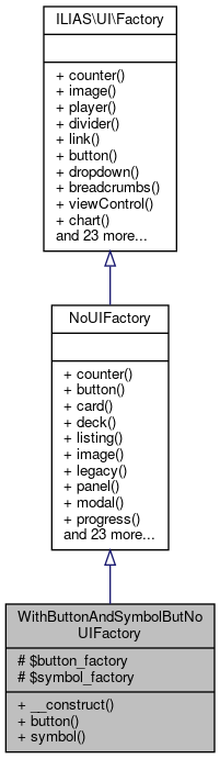 Collaboration diagram for WithButtonAndSymbolButNoUIFactory:
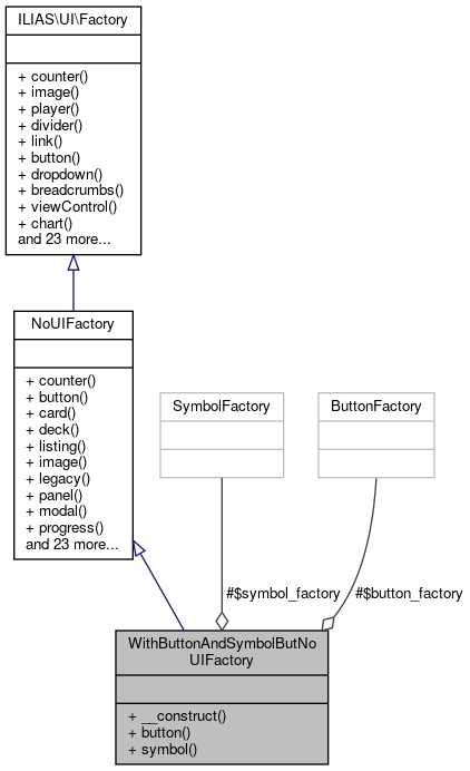
Public Member Functions | |
| __construct (ButtonFactory $button_factory, SymbolFactory $symbol_factory) | |
| button () | |
description: purpose: > Buttons trigger interactions that change the system’s or view's status. More... | |
| symbol () | |
description: purpose: > Symbols are graphical representations of concepts or contexts quickly comprehensible or generally known to the user. More... | |
| Public Member Functions inherited from NoUIFactory | |
| counter () | |
description: purpose: > Counter inform users about the quantity of items indicated by a glyph. More... | |
| button () | |
description: purpose: > Buttons trigger interactions that change the system’s or view's status. More... | |
| card () | |
description: purpose: > A card is a flexible content container for small chunks of structured data. More... | |
| deck (array $cards) | |
description: purpose: > Decks are used to display multiple Cards in a grid. More... | |
| listing () | |
description: purpose: > Listings are used to structure itemised textual information. More... | |
| image () | |
description: purpose: The Image component is used to display images of various sources. More... | |
| legacy (string $content) | |
description: purpose: > This component is used to wrap an existing ILIAS UI element into a UI component. More... | |
| panel () | |
description: purpose: > Panels are used to group titled content. More... | |
| modal () | |
description: purpose: The Modal forces users to focus on the task at hand. More... | |
| progress () | |
description: purpose: > A Progress component is designed to represent the users advancement within a certain process or task. More... | |
| dropzone () | |
description: purpose: > Dropzones are containers used to drop either files or other HTML elements. More... | |
| popover () | |
description: purpose: > Popovers can be used when space is scarce i.e. More... | |
| divider () | |
description: purpose: > A divider marks a thematic change in a sequence of other components. More... | |
| link () | |
description: purpose: > Links are used navigate to other resources or views of the system by clicking or tapping them. More... | |
| dropdown () | |
description: purpose: > Dropdowns reveal a list of interactions that change the system’s status or navigate to a different view. More... | |
| item () | |
description: purpose: > An item displays a unique entity within the system. More... | |
| viewControl () | |
description: purpose: > View Controls switch between different visualisation of data. More... | |
| breadcrumbs (array $crumbs) | |
description: purpose: > Breadcrumbs is a supplemental navigation scheme. More... | |
| chart () | |
description: purpose: > Charts are used to graphically represent data in various forms such as maps, graphs or diagrams. More... | |
| input () | |
description: purpose: > In opposite to components with a purely receptive or at most navigational character, input elements are used to relay user-induced data to the system. More... | |
| table () | |
description: purpose: > Tables present a set of uniformly structured data. More... | |
| messageBox () | |
description: purpose: > Message Boxes inform the user about the state of the system or an ongoing user task. More... | |
| layout () | |
description: purpose: > Layout components are components used for the overall construction of the user interface. More... | |
| mainControls () | |
description: purpose: > Main Controls are components that are always usable, depending only on overall configuration or roles of the user, not depending on the current content. More... | |
| tree () | |
description: purpose: > Trees present hierarchically structured data. More... | |
| menu () | |
description: purpose: > Menus let the user choose from several (navigational) options. More... | |
| symbol () | |
description: purpose: > Symbols are graphical representations of concepts or contexts quickly comprehensible or generally known to the user. More... | |
| toast () | |
description: purpose: Toasts are temporary messages from the system published to the user. More... | |
| player () | |
description: purpose: > The Player component is used to play and control a media source. More... | |
| launcher () | |
description: purpose: > The Launcher starts an object, a process or a workflow. More... | |
| helpTopics (string ... $topic) | |
description: purpose: > Help Topics can be attached to certain components. More... | |
| entity () | |
description: purpose: > An Entity displays information about entities within the system, when the purpose is to represent the entity itself. More... | |
| prompt () | |
description: purpose: > A Prompt requires a user to make some inputs to the system, like making choices, acknowleding an important information or filling out a form. More... | |
Protected Attributes | |
| ButtonFactory | $button_factory |
| SymbolFactory | $symbol_factory |
Detailed Description
Definition at line 35 of file FileInputTest.php.
Constructor & Destructor Documentation
◆ __construct()
| WithButtonAndSymbolButNoUIFactory::__construct | ( | ButtonFactory | $button_factory, |
| SymbolFactory | $symbol_factory | ||
| ) |
Definition at line 40 of file FileInputTest.php.
References $button_factory, and $symbol_factory.
Referenced by FileInputTest\getUploadHandler().
Here is the caller graph for this function: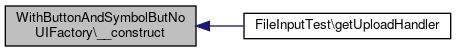
Member Function Documentation
◆ button()
| WithButtonAndSymbolButNoUIFactory::button | ( | ) |
description: purpose: > Buttons trigger interactions that change the system’s or view's status.
Acceptable changes to the current view are those that do not result in a complete replacement of the overall screen (e.g. modals). composition: > Button is a clickable, graphically obtrusive control element. It can bear text and/or a Glyph. effect: > On-click, the action indicated by the button is carried out. A stateful button will indicate its state with the engaged state. rivals: links: > Links are used to trigger Interactions that do not change the systems status. They are usually contained inside a Navigational Collection. background: > Wording rules have been inspired by the iOS Human Interface Guidelines (UI-Elements->Controls->System Button) Style rules have been inspired from the GNOME Human Interface Guidelines->Buttons. Concerning aria-roles, see: https://developer.mozilla.org/en-US/docs/Web/Accessibility/ARIA/Roles/button_role rules: usage: 1: > Buttons MUST NOT be used inside a Textual Paragraph. interaction: 2: > If an action is temporarily not available, Buttons MUST be disabled by setting as type 'disabled'. 3: > A button MUST NOT be used for navigational purpose. style: 1: > If Text is used inside a Button, the Button MUST be at least six characters wide. 2: > The Button MUST be designed in a way it is perceived as important and active, but not clickable, if the Button is engaged. wording: 1: > The caption of a Button SHOULD contain no more than two words. 2: > The wording of the button SHOULD describe the action the button performs by using a verb or a verb phrase. 3: > Every word except articles, coordinating conjunctions and prepositions of four or fewer letters MUST be capitalized. 4: > For standard events such as saving or canceling the existing standard terms MUST be used if possible: Save, Cancel, Delete, Cut, Copy. 5: > There are cases where a non-standard label such as “Send Mail” for saving and sending the input of a specific form might deviate from the standard. These cases MUST however specifically justified. accessibility: 1: > DOM elements of type "button" MUST be used to properly identify an element as a Button if there is no good reason to do otherwise. 2: > Button DOM elements MUST either be of type "button", of type "a" accompanied with the aria-role “Button” or input along with the type attribute “button” or "submit". 3: > If the Button is carrying the focus (e.g. by tabbing) and is visible it MUST always be visibly marked (e.g. by some sort of highlighting). 4: > All Buttons visible in a view MUST be accessible by keyboard by using the ‘Tab’-Key. 5: > The engaged state MUST be reflected in the "aria-pressed" -, respectively the "aria-checked"-attribute if active. If the Button is not engaged (which is the default), the aria-attribute can be omitted. composition: 1: >
If a button has a help topic, it should be rendered as a tool tip.
- Returns
Implements ILIAS\UI\Factory.
Definition at line 46 of file FileInputTest.php.
References $button_factory.
◆ symbol()
| WithButtonAndSymbolButNoUIFactory::symbol | ( | ) |
description: purpose: > Symbols are graphical representations of concepts or contexts quickly comprehensible or generally known to the user.
composition: Symbols contain a graphical along with textual representation describing, what the graphic is depicting. rules: accessibility: 1: Symbols MUST have labels which then might be used to display some alternative text (e.g. as alt attribute). 2: The label of the Symbol MUST NOT be displayed, if the Symbol has a purely decorative function (as e.g. in
primary buttons).
- Returns
Implements ILIAS\UI\Factory.
Definition at line 51 of file FileInputTest.php.
References $symbol_factory.
Field Documentation
◆ $button_factory
|
protected |
Definition at line 37 of file FileInputTest.php.
Referenced by __construct(), and button().
◆ $symbol_factory
|
protected |
Definition at line 38 of file FileInputTest.php.
Referenced by __construct(), and symbol().
The documentation for this class was generated from the following file:
- components/ILIAS/UI/tests/Component/Input/Field/FileInputTest.php