This is how the factory for UI elements looks. More...
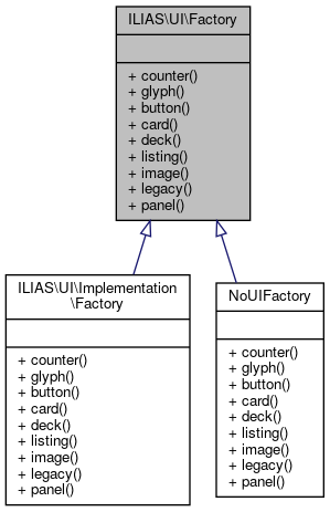
 Inheritance diagram for ILIAS\UI\Factory:
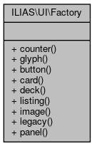
 Collaboration diagram for ILIAS\UI\Factory:
Public Member Functions | |
| counter () | |
| glyph () | |
| button () | |
| card ($title, \ILIAS\UI\Component\Image\Image $image=null) | |
| deck (array $cards) | |
| listing () | |
| image () | |
| legacy ($content) | |
| panel () | |
Detailed Description
This is how the factory for UI elements looks.
This should provide access to all UI elements at some point.
Consumers of the UI-Service MUST program against this interface and not use any concrete implementations from Internal.
Definition at line 15 of file Factory.php.
Member Function Documentation
◆ button()
| ILIAS\UI\Factory::button | ( | ) |
description: purpose: > Buttons trigger interactions that change the system’s status. Usually Buttons are contained in an Input Collection. The Toolbar is the main exception to this rule, since buttons in the Toolbar might also perform view changes. composition: > Button is a clickable, graphically obtrusive control element. It can bear text. effect: > On-click, the action indicated by the button is carried out. rivals: glyph: > Glyphs are used if the enclosing Container Collection can not provide enough space for textual information or if such an information would clutter the screen. links: > Links are used to trigger Interactions that do not change the systems status. They are usually contained inside a Navigational Collection.
background: > Wording rules have been inspired by the iOS Human Interface Guidelines (UI-Elements->Controls->System Button)
Style rules have been inspired from the GNOME Human Interface Guidelines->Buttons.
rules: usage: 1: > Buttons MUST NOT be used inside a Textual Paragraph. interaction: 1: > A Button SHOULD trigger an action. Only in Toolbars, Buttons MAY also change the view. 2: > If an action is temporarily not available, Buttons MUST be disabled by setting as type 'disabled'. style: 1: > If Text is used inside a Button, the Button MUST be at least six characters wide. wording: 1: > The caption of a Button SHOULD contain no more than two words. 2: > The wording of the button SHOULD describe the action the button performs by using a verb or a verb phrase. 3: > Every word except articles, coordinating conjunctions and prepositions of four or fewer letters MUST be capitalized. 4: > For standard events such as saving or canceling the existing standard terms MUST be used if possible: Save, Cancel, Delete, Cut, Copy. 5: > There are cases where a non-standard label such as “Send Mail” for saving and sending the input of a specific form might deviate from the standard. These cases MUST however specifically justified. accessibility: 1: > DOM elements of type "button" MUST be used to properly identify an element as a Button if there is no good reason to do otherwise. 2: > Button DOM elements MUST either be of type "button", of type "a" accompanied with the aria-role “Button” or input along with the type
attribute “button” or "submit".
- Returns
- \ILIAS\UI\Component\Button\Factory
Implemented in ILIAS\UI\Implementation\Factory, and NoUIFactory.
◆ card()
| ILIAS\UI\Factory::card | ( | $title, | |
| \ILIAS\UI\Component\Image\Image | $image = null |
||
| ) |
description: purpose: > A card is a flexible content container for small chunks of structured data. Cards are often used in so-called Decks which are a gallery of Cards. composition: > Cards contain a header, which often includes an Image or Icon and a Title as well as possible actions as Default Buttons and 0 to n sections that may contain further textual descriptions, links and buttons. effect: > Cards may contain Interaction Triggers. rivals: Heading Panel: Heading Panels fill up the complete available width in the Center Content Section. Multiple Heading Panels are stacked vertically. Block Panels: Block Panels are used in Sidebars
featurewiki:
rules: composition: 1: Cards MUST contain a title. 2: Cards SHOULD contain an Image or Icon in the header section. 3: Cards MAY contain Interaction Triggers. style: 1: Sections of Cards MUST be separated by Dividers. accessibility:
1: If multiple Cards are used, they MUST be contained in a Deck.
- Parameters
-
string $title \ILIAS\UI\Component\Image\Image $image
- Returns
- \ILIAS\UI\Component\Card\Card
Implemented in NoUIFactory.
◆ counter()
| ILIAS\UI\Factory::counter | ( | ) |
description: purpose: > Counter inform users about the quantity of items indicated by a glyph. composition: > Counters consist of a number and some background color and are placed one the 'end of the line' in reading direction of the item they state the count for. effect: > Counters convey information, they are not interactive.
featurewiki:
rules: usage: 1: A counter MUST only be used in combination with a glyph. composition: 1: > A counter MUST contain exactly one number greater than zero and no
other characters.
- Returns
- \ILIAS\UI\Component\Counter\Factory
Implemented in ILIAS\UI\Implementation\Factory, and NoUIFactory.
◆ deck()
| ILIAS\UI\Factory::deck | ( | array | $cards | ) |
description: purpose: > Decks are used to display multiple Cards in a grid. They should be used if a page contains many content items that have similar style and importance. A Deck gives each item equal horizontal space indicating that they are of equal importance. composition: > Decks are composed only of Cards arranged in a grid. The cards displayed by decks are all of equal size. This Size ranges very small (XS) to very large (XL). effect: > The Deck is a mere scaffolding element, is has no effect.
featurewiki:
rules: usage: 1: Decks MUST only be used to display multiple Cards. style:
1: The number of cards displayed per row MUST adapt to the screen size.
- Parameters
-
\ILIAS\UI\Component\Card\Card[] $cards
- Returns
- \ILIAS\UI\Component\Deck\Deck
Implemented in ILIAS\UI\Implementation\Factory, and NoUIFactory.
◆ glyph()
| ILIAS\UI\Factory::glyph | ( | ) |
description: purpose: > Glyphs map a generally known concept or symbol to a specific concept in ILIAS. Glyphs are used when space is scarce. composition: > A glyph is a typographical character that represents something else. As any other typographical character, they can be manipulated by regular CSS. If hovered they change their background to indicate possible interactions. effect: > Glyphs act as trigger for some action such as opening a certain Overlay type or as shortcut. rivals: icon: > Standalone Icons are not interactive. Icons can be in an interactive container however. Icons merely serve as additional hint of the functionality described by some title. Glyphs are visually distinguished from object icons: they are monochrome. background: > "In typography, a glyph is an elemental symbol within an agreed set of symbols, intended to represent a readable character for the purposes of writing and thereby expressing thoughts, ideas and concepts." (https://en.wikipedia.org/wiki/Glyph)
Lidwell states that such symbols are used "to improve the recognition and recall of signs and controls".
rules: usage: 1: Glyphs MUST NOT be used in content titles. 2: > Glyphs MUST be used for cross-sectional functionality such as mail for example and NOT for representing objects. 3: > Glyphs SHOULD be used for very simple tasks that are repeated at many places throughout the system. 4: > Services such as mail MAY be represented by a glyph AND an icon. style: 1: > All Glyphs MUST be taken from the Bootstrap Glyphicon Halflings set. Exceptions MUST be approved by the JF. accessibility: 1: > The functionality triggered by the Glyph must be indicated to
screen readers with by the attribute aria-label or aria-labelledby attribute.
- Returns
- \ILIAS\UI\Component\Glyph\Factory
Implemented in ILIAS\UI\Implementation\Factory, and NoUIFactory.
◆ image()
| ILIAS\UI\Factory::image | ( | ) |
description: purpose: The Image component is used to display images of various sources. composition: An Image is composed of the image and an alternative text for screen readers. effect: Images may be included in interacted components but not interactive on their own.
rules: accessibility: 1: > Images MUST contain the alt attribute. This attribute MAY be left empty (alt="") if the image is of decorative nature. According to the WAI, decorative images don’t add information to the content of a page. For example, the information provided by the image might already be given using adjacent text, or the image might be included to make the website more visually attractive
(see https://www.w3.org/WAI/tutorials/images/decorative/).
- Returns
- \ILIAS\UI\Component\Image\Factory
Implemented in ILIAS\UI\Implementation\Factory, and NoUIFactory.
◆ legacy()
| ILIAS\UI\Factory::legacy | ( | $content | ) |
description: purpose: > This component is used to wrap an existing ILIAS UI element into a UI component. This is useful if a container of the UI components needs to contain content that is not yet implement in the centralized UI components. composition: > The legacy component contains html or any other content as string.
rules: usage: 1: > This component MUST only be used to ensure backwards compatibility with existing UI elements in ILIAS,
therefore it SHOULD only contain Elements which cannot be generated using other UI Components from the UI Service.
- Parameters
-
string $content
- Returns
- \ILIAS\UI\Component\Legacy\Legacy
Implemented in ILIAS\UI\Implementation\Factory, and NoUIFactory.
◆ listing()
| ILIAS\UI\Factory::listing | ( | ) |
description: purpose: > Listings are used to structure itemised textual information. composition: > Listings may contain ordered, unordered, or labeled items. effect: > Listings hold only textual information. They may contain Links but no Buttons. rules: composition:
1: Listings MUST NOT contain Buttons.
- Returns
- \ILIAS\UI\Component\Listing\Factory
Implemented in ILIAS\UI\Implementation\Factory, and NoUIFactory.
◆ panel()
| ILIAS\UI\Factory::panel | ( | ) |
description: purpose: > Panels are used to group titled content. composition: > Panels consist of a header and content section. They form one Gestalt and so build a perceivable cluster of information. effect: The effect of interaction with panels heavily depends on their content.
rules: wording:
1: Panels MUST contain a title.
- Returns
- \ILIAS\UI\Component\Panel\Factory
Implemented in ILIAS\UI\Implementation\Factory, and NoUIFactory.
The documentation for this interface was generated from the following file:
- src/UI/Factory.php


